UI Widgets 
Introduction 
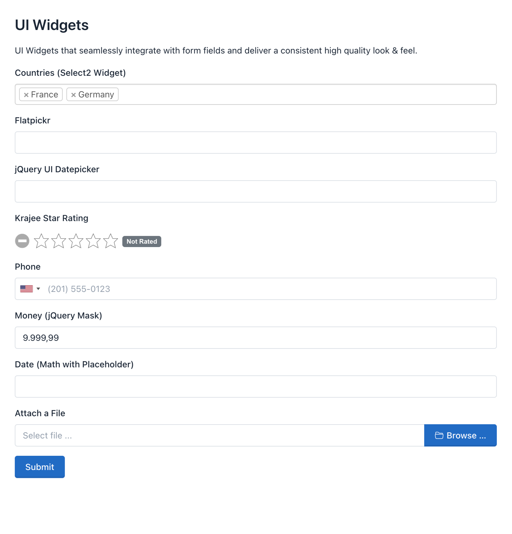
UI widgets are custom controls that improve the visualization of our Standard HTML5 fields. For example, we can use the "International Telephone Input" widget to display a Dropdown with flags and country codes as dynamic placeholders. Of course, we can customize them by making use of the Form Builder's custom attributes.
How to use a UI Widget 
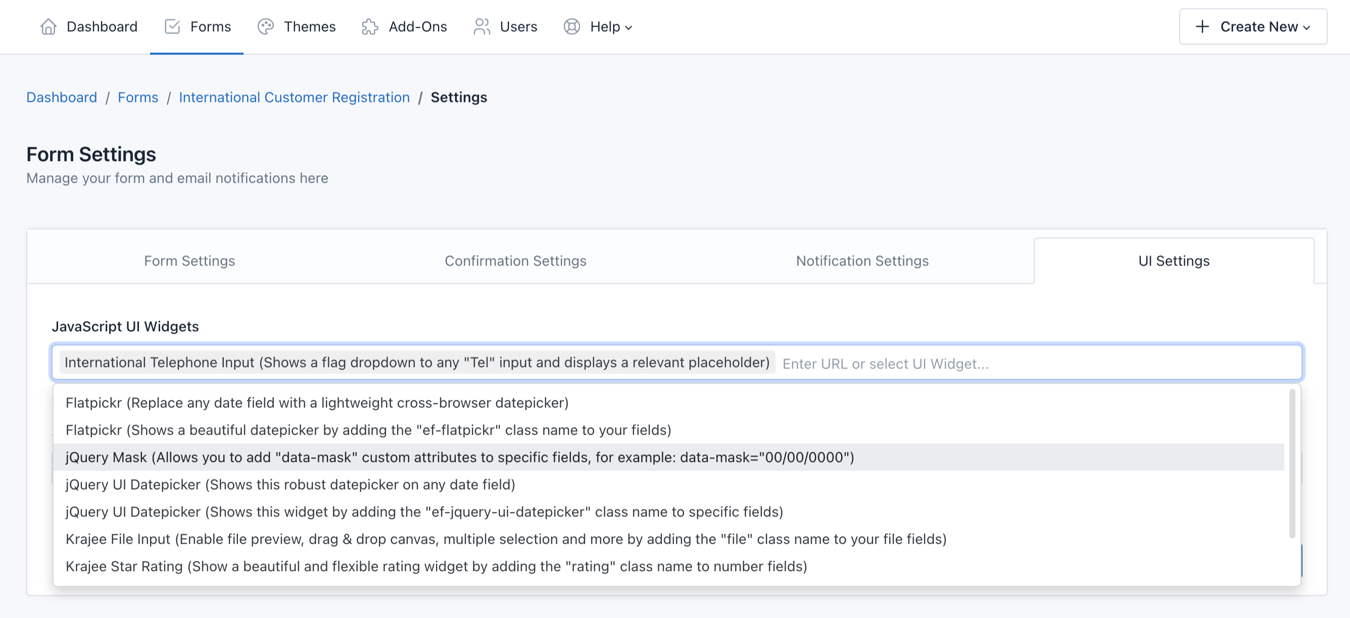
Using UI widgets is pretty easy, just go to Form Settings > UI Settings and select the UI widget you want to use in your form.
For example, we are going to select the "International Telephone Input" widget and click Save.
Let's see the result.
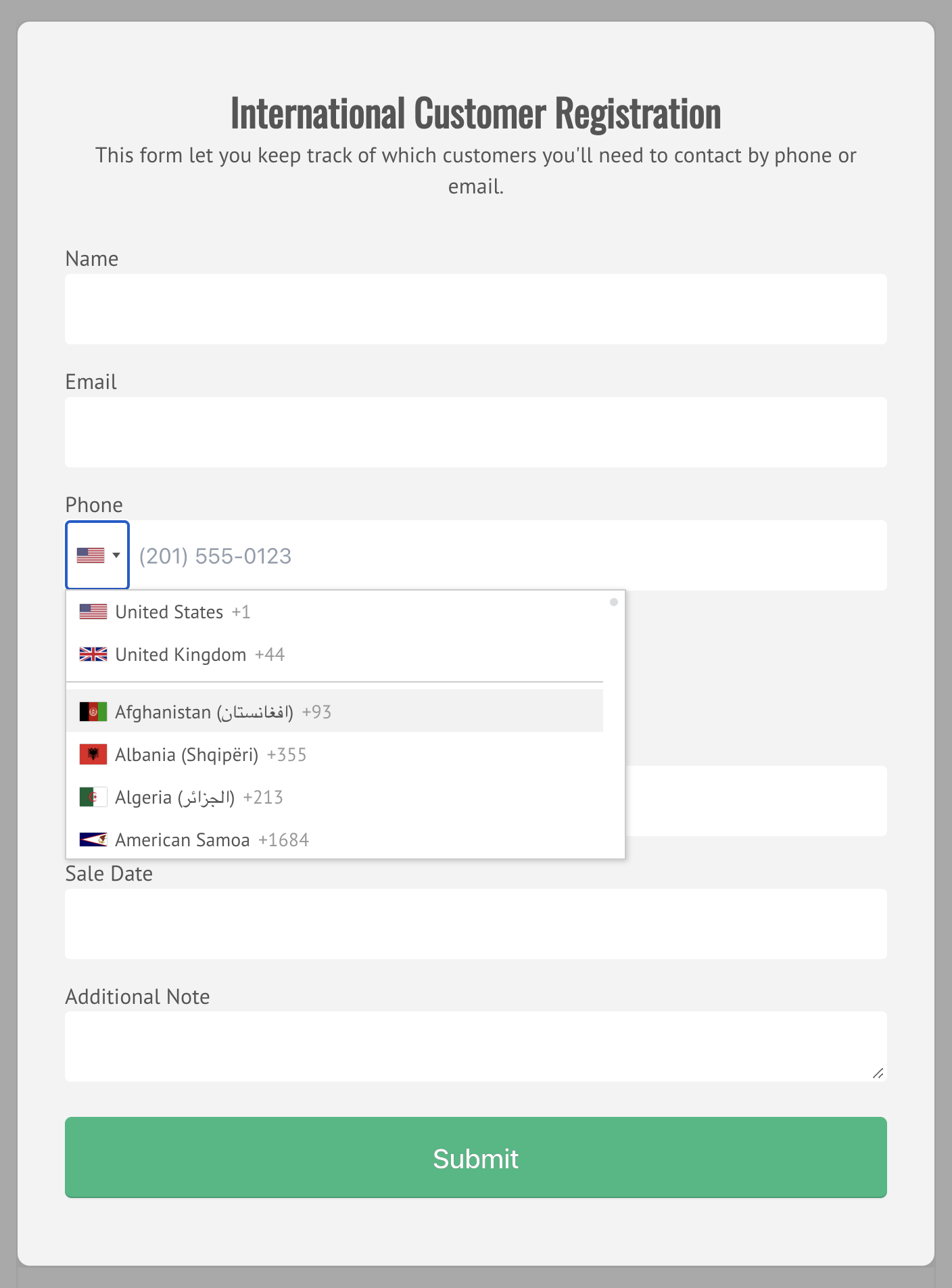
Take into account that some widgets require to add a Css Class to your Form Field. For others, like in our previous example, we only need to activate them to display them in the form.
How to configure a UI Widget 
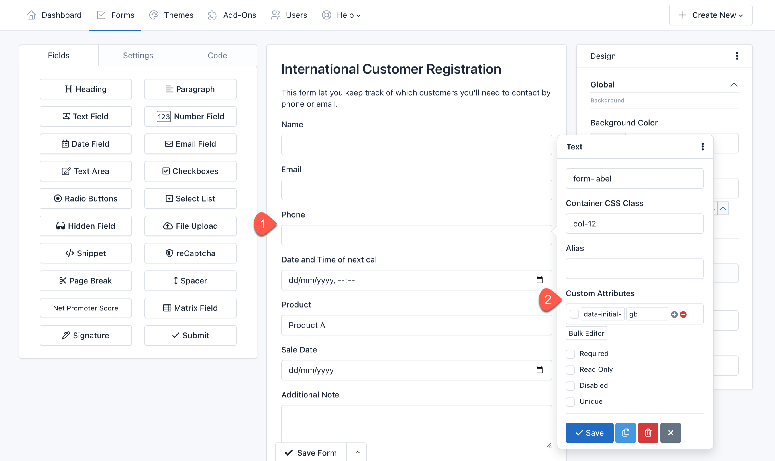
To configure the UI Widget we want to use, we need to go to the Form Builder > Field Settings > Custom Attributes.
In our example, the International Telephone Inputs displays the User country flag. For this example, we are going to customize this behavior to display the flag of Great Britain. For this we are going to add the following custom attribute:
- Attribute: data-initial-country
- Value: gb
And, Save all.
Let's see the result.
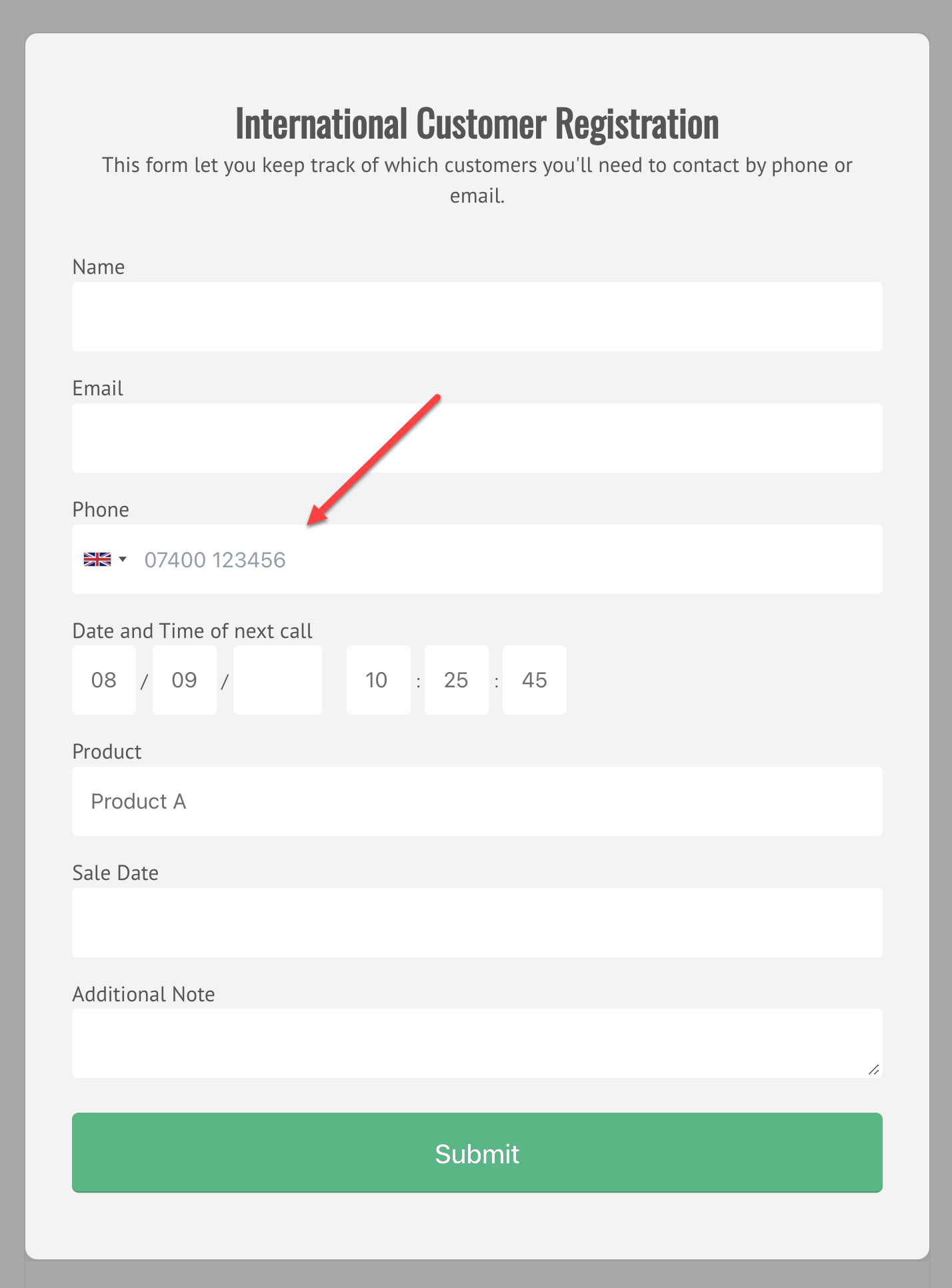
Custom Attributes For UI Widgets 
Now we are going to list all the attributes we can use to configure the UI Widgets.
Flatpickr 
Replace any Date field with a lightweight cross-browser datepicker.
- data-alt-format: A string of characters which are used to define how the date will be displayed in the input box. For example: F j, Y
- data-allow-invalid-preload: Allows the preloading of an invalid date. It can be true or false.
- data-aria-date-format: Defines how the date will be formatted in the aria-label for calendar days. For example: F j, Y
- data-default-date: Sets the initial selected date in HTML5 format (yyyy-mm-dd). For example: 2021-12-31
- data-default-hour: Initial value of the hour element. For example: 12
- data-default-minute: Initial value of the minute element. For example: 0
- data-disable: A comma-separated dates in HTML5 format. For example: 2022-01-01,2022-01-02,2022-01-03
- data-disable-mobile: Set to true to always use the non-native picker. It can be true or false.
- data-enable-time: Enables time picker. It can be true or false.
- data-enable-seconds: Enables seconds in the time picker. It can be true or false.
- data-hour-increment: Adjusts the step for the hour input (incl. scrolling). For example: 1
- data-inline: Displays the calendar inline. It can be true or false.
- data-max-date: The maximum date that a user can pick to (inclusive). For example: 2021-12-31
- data-min-date: The minimum date that a user can start picking from (inclusive). For example: 2021-12-01
- data-minute-increment: Adjusts the step for the minute input (incl. scrolling). For example: 5
- data-mode: "single", "multiple", or "range". Date fields are only compatible with "single" mode, but you can use the others with Text fields.
- data-next-arrow: HTML for the arrow icon, used to switch months. For example: >
- data-no-calendar: Hides the day selection in calendar. Use it along with "data-enable-time" to create a time picker. This is not compatible with a Date field, but you can use it with Text fields.
- data-position: Where the calendar is rendered relative to the input vertically and horizontally In the format of "[vertical] [horizontal]". Vertical can be auto, above or below (required). Horizontal can be left, center or right. For example: "above" or "auto center"
- data-prev-arrow: HTML for the left arrow icon. For example: <
- data-shorthand-current-month: Show the month using the shorthand version (ie, Sep instead of September). It can be true or false.
- data-show-months: The number of months to be shown at the same time when displaying the calendar. For example: 1
- data-time-24hr: Displays time picker in 24 hour mode without AM/PM selection when enabled. It can be true or false.
- data-week-numbers: Enables display of week numbers in calendar.
- data-month-selector-type: How the month should be displayed in the header of the calendar. It can be "dropdown" or "static". If "data-show-months" has a value greater than 1, the month is always shown as static.
International Telephone Input 
Adds a flag dropdown to Phone fields and displays a relevant placeholder. The user types their national number and the plugin send the full standardized international number.
- data-initial-country: It can be "auto" or a two-letter country code, for example: "us", "gb" or "it".
jQuery Mask 
Make masks on form fields and HTML elements.
- data-mask: To get your mask applied with the data-mask attribute just use it. For example: 00/00/0000
- data-mask-placeholder: To add a placeholder to your mask. For example: "//____"
- data-mask-reverse: Activating a reversible mask. It can be true or false.
- data-mask-clearifnotmatch: Clear field if not match. It can be true or false.
- data-mask-selectonfocus: Select Mask On Focus. It can be true or false.
Common values that you can add to the "data-mask" custom attribute:
- Date: 00/00/0000
- Time: 00:00:00
- DateTime: 00/00/0000 00:00:00
- CEP: 00000-000
- Phone: 0000-0000
- Phone with DDD: (00) 0000-0000
- US Phone: (000) 000-0000
- Mixed: AAA 000-S0S
- IP Address: 099.099.099.099
- Accept Only Numbers: 0#
jQuery Ui Datepicker 
Select a date from a popup or inline calendar on any 'date' field.
- data-date-format: The format for parsed and displayed dates. For example: mm/dd/yy
- data-show-button-panel: Whether to display a button pane underneath the calendar. It can be true or false.
- data-change-month: Whether the month should be rendered as a dropdown instead of text. It can be true or false.
- data-change-year: Whether the year should be rendered as a dropdown instead of text. It can be true or false.
- data-year-range: The range of years displayed in the year drop-down. For example: 2019:2022
- data-number-of-months: The number of months to show at once. For example: 1
- data-min-date: The minimum selectable date. For example, "+1m +7d" represents one month and seven days from today
- data-max-date: The maximum selectable date. For example, "+1m +7d" represents one month and seven days from today.
- data-is-rtl: Whether the current language is drawn from right to left. It can be true or false.
- data-show-week: When true, a column is added to show the week of the year. It can be true or false.
- data-first-day: Set the first day of the week: Sunday is 0, Monday is 1, etc.
Krajee File Input 
Add the "file" css class to the file field to enhance the HTML 5 file input.
- data-browse-label: The label to display for the file picker/browse button. Defaults to Browse...
- data-browse-icon: The icon to display before the label for the file picker/browse button. Defaults to
- data-remove-label: The label to display for the file remove button. Defaults to Remove.
- data-remove-icon: The icon to display before the label for the file remove button. Defaults to .
- data-cancel-label: The label to display for the file upload cancel button. Defaults to Cancel.
- data-cancel-icon: The icon to display before the label for the file upload cancel button. Defaults to .
- data-upload-label: The label to display for the file upload button. Defaults to Upload.
- data-upload-icon: The icon to display before the label for the file upload button. Defaults to .
- data-show-preview: Whether to display the file preview. It can be true or false. Defaults to true.
- data-show-browse: Whether to display the file browse button. It can be true or false. Defaults to true.
- data-show-remove: Whether to display the file remove/clear button. It can be true or false. Defaults to true.
- data-show-upload: Whether to display the file upload button. It can be true or false. Defaults to true.
Krajee Star Rating 
Display a Star Rating widget on any field with the .rating css class. Also, we can use a custom theme with the following css classes:
- .rating-theme-fas: Font Awesome 5.x Theme
- .rating-theme-uni: Unicode Theme
- .rating-theme-gly: Glyphicons Theme
We can customize this widget by using the following custom attributes:
- data-container-class: The CSS class to be appended to the star rating container. This is useful if you want to prefix some CSS class to the container and override the plugin widget styling for your use case.
- data-empty-star: The symbol markup to display for an empty star. Defaults to:
- data-filled-star: The symbol markup to display for a filled / highlighted star:
- data-stars: The number of stars to display. Defaults to 5.
- data-min: The minimum value for the rating input. Defaults to 0.
- data-max: The maximum value for the rating input. Defaults to 5.
- data-step: The step to increment the rating when each star is clicked. Defaults to 0.5.
- data-rtl: Whether the rating input is to be oriented RIGHT TO LEFT. It can be true or false. Defaults to false.
- data-show-caption: Whether the rating caption is to be displayed. It can be true or false. Defaults to true.
- data-size: Size of the rating control. One of xl, lg, md, sm, or xs. Defaults to md.
- data-default-caption: The default caption text, which will be displayed when no caption is set up for the rating. Defaults to {rating} Stars.
- data-star-caption: The caption text corresponding to one star. Defaults to One star.
- data-star-captions: The caption text corresponding to multiple star. Defaults to {rating} stars.
- data-clear-button: The markup for displaying the clear button. Defaults to
- data-clear-button-title: The title displayed on clear button hover. Defaults to Clear.
- data-clear-caption: The caption displayed when clear button is clicked. Defaults to Not Rated.
Select2 
Display a Select2 widget on a Select List field with the .select2 css class.
We can customize this widget by using the following custom attributes:
- data-theme: The theme to be used by the widget. It can be classic or bootstrap. Defaults to bootstrap.
- data-placeholder: The placeholder to be displayed when no option is selected. For example: "Select a country".
- data-allow-clear: Allows the user to clear the current selection. It should be used with "data-placeholder" to work. It can be true or false.
- data-tags: Allows the user to create new options from text input by the user in the search box. It can be true or false.
- data-maximum-selection-length: For example: 2
- data-minimum-input-length: Only start searching when the user has input a number of characters. For example: 3
- data-maximum-input-length: Allows you to limit the length of the search term such that it does not exceed a certain length. For example: 20
- data-minimum-results-for-search: Allows you to hide the search box depending on the number of results. For example: 3.